The scent of freshly baked bread wafts through the air, warm and familiar, like a quiet invitation. Behind the glass counter, desserts glisten under soft light. Pastries glazed to perfection, tarts that promise a delicate crumble. The menu reads like a map of faraway places. Flavours from distant coasts and bustling streets, each dish a story waiting to unfold.
But what truly pulls you in isn’t on the plate. You realise it’s the space. The hush of terracotta walls holding the day’s warmth, the whisper of muted greens that calm the senses, the slow pour of golden sunlight slipping through tall windows. You step inside, and suddenly, everything feels unhurried.
Here, colour doesn’t just decorate, it orchestrates. For designers and architects, it’s a powerful tool shaping emotion, guiding appetite, and setting the rhythm of a meal. Because colour psychology in restaurant interiors is an atmosphere made tangible.
Why Colour Matters in Dining Spaces
Colour has the power to shape mood, appetite, and even the way a dish is perceived. When we speak of colour psychology in restaurant interiors, we’re composing an emotional journey before the first bite.
The benefits unfold deliberately in the background, letting you dictate ambiance through color.
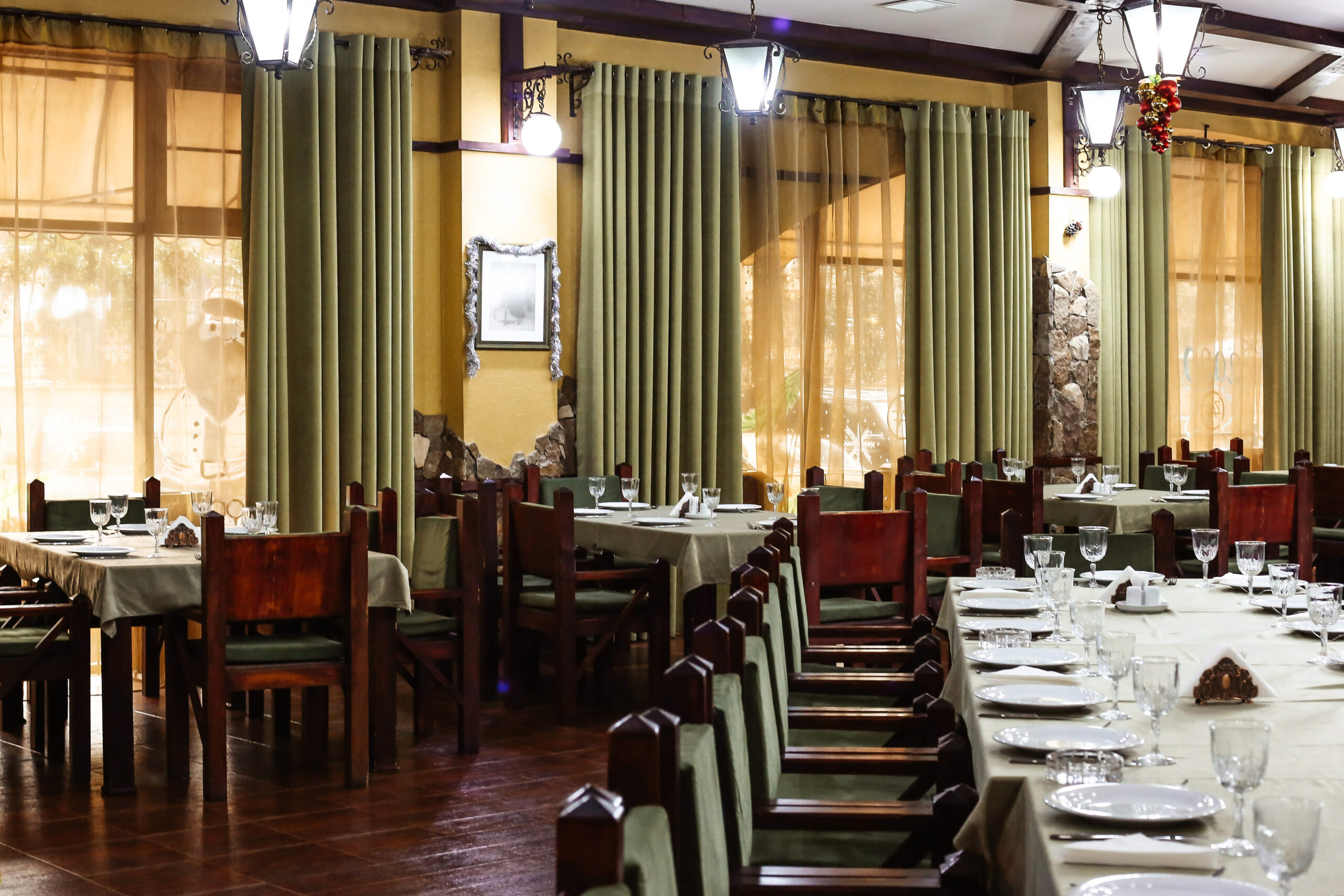
Burnt ochre and terracotta are energy-evoking hues, inviting spirited chatter and connection. Soft greens and muted teals usher in rest. Vibrant reds and glowing oranges awaken the senses, favourable in eateries wanting energy and quick turnover, while blues and deep greens calm the pace, coaxing a slower rhythm to dining.
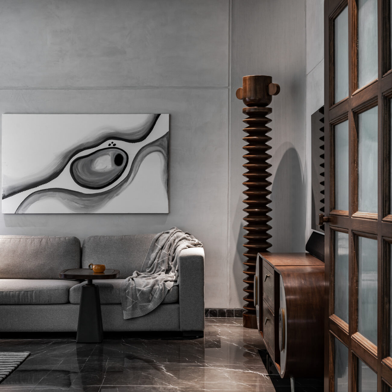
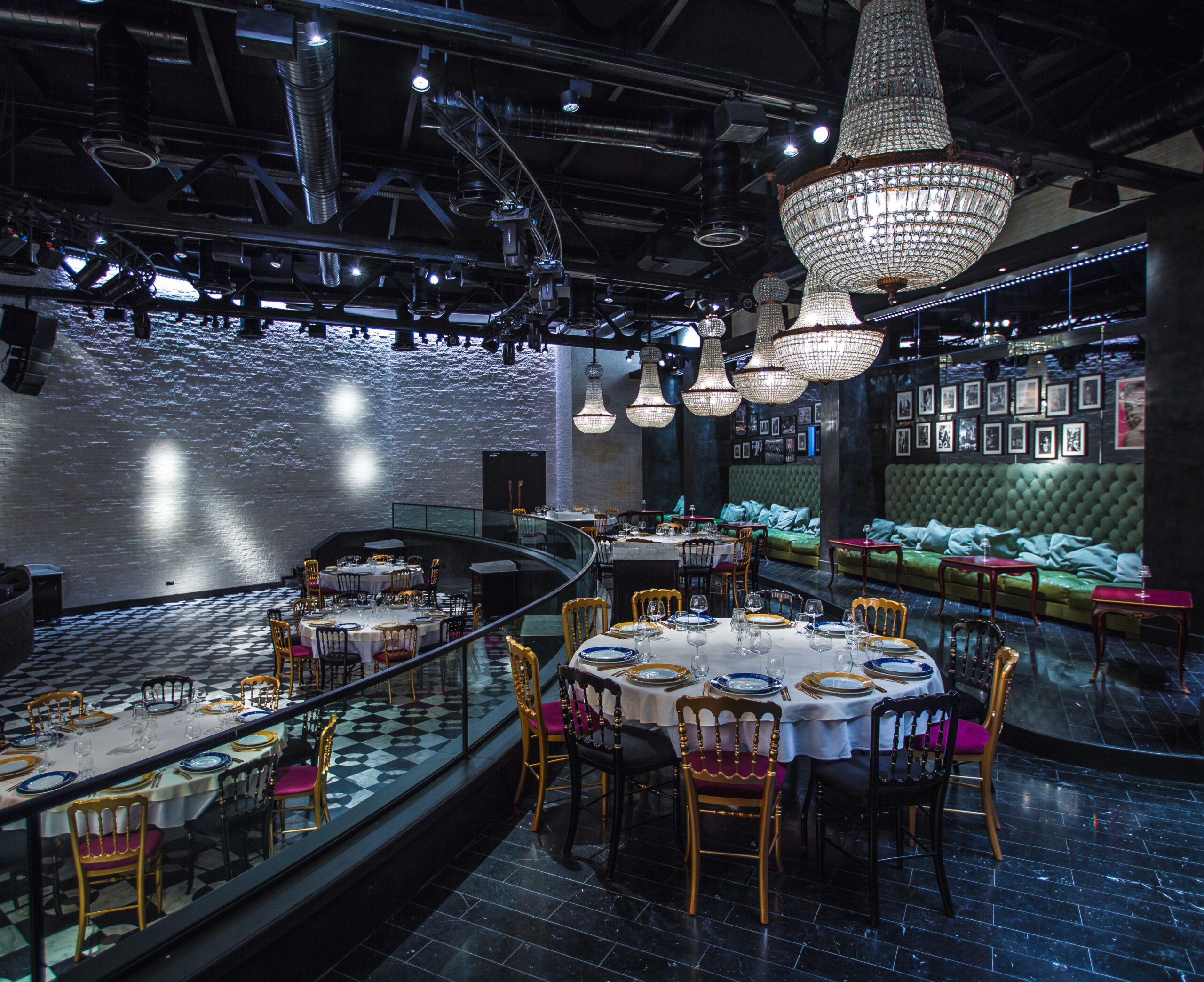
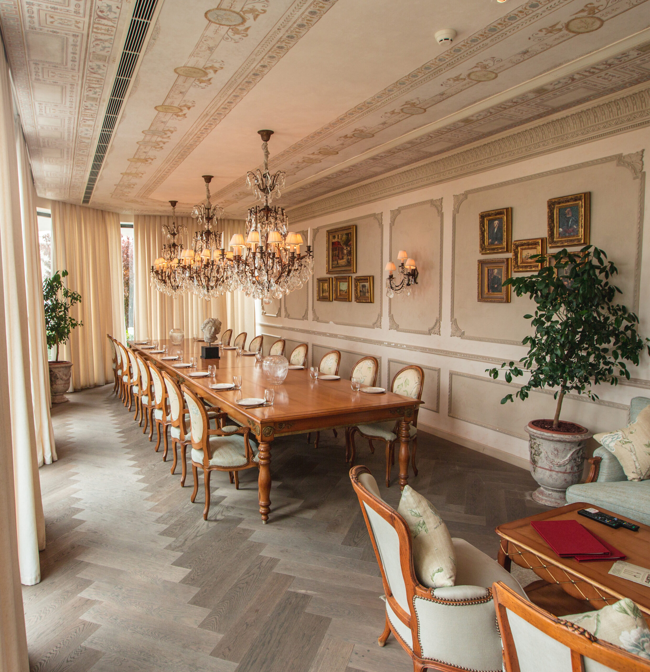
In intimate settings, pale neutrals and light tones expand walls and ceilings, making a small restaurant breathe. In grand dining rooms, shades like charcoal, olive, or deep aubergine draw the space inward, creating cocoons of conversation.
Your restaurant branding through color signals if the meal is casual or refined, herbal or indulgent, traditional or experimental. Your palette becomes a prelude to the menu. You must remain mindful of cultural meanings, balancing regional associations with universal restaurant color schemes.
Basic Categories: Appetite Stimulators, Mild Stimulants, Suppressors
Some of the best colours for restaurants exist on a spectrum, from stimulants to suppressors, each dictating a different tempo.
Strong Appetite Stimulants: Reds, Oranges, and Yellows
Warm tones for appetite are important; they awaken the senses.
Red in dining spaces is known to raise heart rate and blood pressure ever so slightly, evoking energy and excitement. It’s the colour of passion, warmth, and intensity, making it ideal for bustling bistros, fast-food chains, or casual eateries that thrive on quick TATs.
Orange creates an atmosphere of comfort and approachability, making people feel welcome and energized.
Yellow, associated with sunlight and positivity, adds cheerfulness and warmth, though it’s best used sparingly since too much can feel overwhelming.
Mild Stimulants: Greens and Turquoises
Greens and turquoises work best when designers want to evoke freshness and calm without dulling the appetite. These hues are associated with nature, balance, and wellness, making them perfect for restaurants that focus on organic, plant-based, or health-driven menus.
Turquoise and aqua tones add a cool, refreshing touch. This is an ideal pick for coastal or tropical themes. They convey a sense of rejuvenation and clarity, inviting guests to relax.
Appetite Suppressants: Blues, Purples, and Deep Tones
The darker end of the spectrum, like the blues, purples, and blacks, tends to reduce appetite when overused.
For instance, blue rarely occurs in natural foods (other than blueberries), which may explain why it subconsciously discourages eating. However, you need cool colors for calm. In the right balance, blue can evoke sophistication and serenity. Usually, fine-dining restaurants or waterfront settings use it.
Purples and deep violets suggest luxury, creativity, and depth, but they’re best used as accents rather than dominant tones. They work well in upscale or themed restaurants where the focus is on experience.
Black, often considered too stark or heavy for dining, can add drama and contrast when paired with warm lighting or metallic finishes.
Choosing a Color Scheme Aligned with Concept and Turnover Goals
Colour directs how guests feel, eat, and remember a dining experience. Here’s a restaurant color psychology guide for you:
1. Define your concept and intention
Every restaurant has a mood, a pace, a story. Ask yourself: Is your space meant to buzz with conversation or unfold over candlelight?
Fast-casual or family-style eateries lean toward warm, lively colours like terracotta, burnt orange, or golden yellow. Fine-dining restaurants or boutique cafes favour muted blues, sage greens, and earthy neutrals. Health-forward or organic cafes draw from olive, sand, and softer tones.
2. Choose a primary colour that matches your goal
Start with one dominant colour that defines your restaurant’s tone. Quick turnover calls for bold shades like red or coral in strategic zones, near the counter or entryway. Leisurely dining prefers soft greens, warm browns, and cool blues. Upscale ambience layers neutral palettes like charcoal, ivory, and espresso with metallic accents.
A fine-dining Indian restaurant might use muted saffron paired with ivory to convey heritage and warmth. At the same time, a Japanese sushi bar opts for charcoal and slate blue for refined minimalism.
3. Build a contemporary scheme
Once the base tone is chosen, build around it.
Pick two or three accent colours, influencing customer mood with color. Incorporate texture like wood grains, rattan, and matte metals to make colours layered.
Align colours with your brand identity as well. For example, a farm-to-table restaurant draws from nature while a dessert cafe leans towards pastels. Consistency across menus, signage, and interiors ensures that your brand feels whole.
4. Test colours under real lighting
Colours shift dramatically under natural versus artificial light. Always view your selected palette in your actual space in the morning, afternoon, and evening.
Remember:
- Warm bulbs enhance reds and golds
- Cool LEDs can flatten soft tones if not balanced
- Daylight reveals the truest hue, so assess before committing
A tip is to use paint swatches or digital renders on key walls to understand how texture and finish (matte vs. gloss) alter perception.
5. Implement gradually and gather feedback
Introduce your palette in stages. Begin with high-impact areas, such as the entrance, bar, or feature wall, before expanding throughout. Observe how guests respond. Do they linger longer? Does the space feel livelier or calmer?
And don’t forget, mood-based restaurant design is iterative. Once you understand how your colours perform in real time, adjust saturation, add texture, or extend hues into new zones like restrooms, corridors, or exterior façades.
Practical Design Guidelines
Some pro tips to keep in mind when choosing color palettes for dining spaces:
- Create ‘invisible exit paths’: For speedier turnover, create these exit paths by giving passageways or walls near restrooms a different, brighter colour
- Place colour spatially: In open kitchens, choose colours that make food pop, such as deep indigo and forest green
- Layer colour with materials: Integrate colour into furniture, flooring, ceilings, and even fixtures. Metallics like brushed copper, matte gold, or oxidized brass act as subtle accent colours, while wooden textures with natural stains can modulate brighter wall colours
- Focus on the ceiling and upper walls, too: Painting ceilings slightly darker than walls can make a high room feel cozy. Plus, light-colored ceilings reflect natural light, enhancing open-air or small interiors
- Consider the psychological path of light and shadow: Lighting and color harmony are important. Factor in shadow and reflections as well. Matte finishes absorb light, glossy or semi-gloss finishes bounce light, while shadows from pendant lights can create focal points
Here, the past isn’t a direct reference—it’s an energy, a freedom we once had before constraints crept in. And the future? It’s unafraid to misbehave.
Color in Supporting Elements
The walls may set the stage, but it’s the details that hold the performance together. According to color theory for restaurants, it breathes through furniture, glints of fixtures, and the flows of fabrics. These supporting elements carry colour in quieter, more tactile ways, grounding the space and making it feel lived-in rather than staged.
Consider the chairs. A bistro might choose bentwood in honey-toned oak, warm and inviting, while a modern wine bar opts for deep emerald velvet that catches the light with every movement.
Upholstery becomes an opportunity to introduce secondary hues. Burnt sienna cushions against cream banquettes, charcoal linen on high-backed seats that frame intimate corners. The fabric itself matters. Texture absorbs or reflects colour differently. Matte weaves soften bold tones, while silk or leather amplifies them, adding lustre and depth.
Tabletops, too, carry weight. Raw marble veined with grey anchors a neutral palette. Lacquered black surfaces turn candlelight into pools of amber. Reclaimed wood, with its natural variations, introduces organic colour that shifts with the grain, sometimes golden, sometimes ash, always grounding.
Coloured glass, including amber, smoke, sea green, filters light itself, tinting the air and softening the atmosphere. Even the choice of bulb matters. Warm LEDs bring richness to earth tones, while cooler temperatures can make blues and greens feel crisp, almost mineral.
Then there are smaller gestures – ceramics such as terracotta bowls, cobalt plates, and jade-glazed vases on open shelves and bar stools in rust or olive. Woven baskets in natural fibres introduce texture without competing for attention. Metallic accents like copper piping along exposed ceilings, gold-rimmed mirrors, oxidised steel table bases must be dispersed thoughtfully.
Every element should add to the story.
Conclusion
Colour is a language spoken through the smallest gestures. The psychology of color in commercial interiors shapes how one arrives, settles, tastes, and remembers.
The most successful color design in hospitality understands how it orchestrates an atmosphere. The right palette can make a narrow room feel expansive or a cavernous hall feel intimate. It signals if the evening is vibrant or restrained. And when well done, colours feel naturally woven into the experience.